FIRST, I'd like to welcome my newest followers. Thank you for joining me my blog. :D I look forward to viewing your comments and I hope you are inspired by my projects and tutorials/videos.
Second, I want to say I hope you all like the new look. I changed my background. lol I am trying to get things a little cleaner on my blog so I will be experimenting with changes to my blog. I really think it needed a change after almost 4 years. Rigghhhtt? :D
Okay, Third, today's post is my design on the Tim Holtz 12 tags of 2016 - April, Technique Remix. With this tag he took us back to March 2012- Faux Mosaic & November 2015 - Paint Resist.
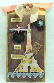
Here is how my tag came out - I think it looks pretty good.
Here are the supplies I used -Ya, know I have never used this die cut from his Framelits Alterations die - French Flight (sizzix). I just loved how it turned out with the mosaic look on the Eiffel Tower.Idea-ology chitchat stickers; Ephemera pack; Industrious stickers; Wall Flower Paper Stash by TH idea-ology.
To acheive the wooden grain look I used my wooden embossing folder then used TH inks to make it look wooden.
TH distress inks - walnut, vintage photo (on wooden embossed top layer); TH Spray Stains - Walnut, Tarnished brass, Tattered rose (on my bottom tag)
I used TH Tattered Rose distress embossing powder for the grout around my mosaic tiles (paper).
Ribbons from my stash.
Challenges entered:
I thoroughly enjoyed making this tag and combining all the TH items together. Hope you are inspired to give this a try. Just follower the link above to head over to TH Blog.
Thanks for stopping by and stay crafty.
Hugs,
Deborah xxx

Hi Deborah, your blog now is soooo clean! :D Your mosaic on the Eiffel Tower is just adorable and all the tag has a Zen look :D Love the wooden embossing and the lace to the bottom. Any detail is so pretty!
ReplyDeleteHugs
Like your version of TH Apr Tag w/ the wonderful mosaic tile look. Especially like the calligraphy nib used since I write calligraphy. Per your blog change I would suggest that you change to a non-white color background because I think the white is too clean looking and a bit hard on the eyes. Have a BEE-utiful day!
ReplyDeleteMelissa
"Sunshine HoneyBee"
Love it!!! I love the Eiffel Tower and the Tim Holtz pen nib!! Beautiful!!
ReplyDeleteYou do gorgeous work~thanks for stopping by today :)
ReplyDelete